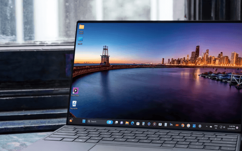
Introduction: The Vital Role of the Window Taskbar
The Window taskbar, an integral component of the user interface, has played a pivotal role in shaping the Windows experience for over a quarter-century. From its inception to its evolution into a central hub, the taskbar has witnessed significant changes, enhancing user productivity and interaction.
Early Windows Versions: Before the Taskbar’s Emergence
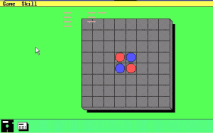
In the early days of Windows 1.0, 2.0, and 3.0 (1985-1992), the taskbar was absent. However, Windows 1.0 and 2.0 introduced a precursor – a program bar that allowed users to minimize programs. This bar, reminiscent of the later taskbar, marked the initial steps toward a more intuitive user interface.
Windows 95: Birth of the Taskbar and Start Menu
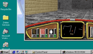
The turning point arrived with Windows 95, where the taskbar and Start menu were introduced. Daniel Oran’s visionary design paved the way for easy access to system functions. The initial taskbar featured a grey design with rectangular minimized windows, setting the foundation for future iterations.
Windows XP and Beyond: Continual Enhancements to the Taskbar
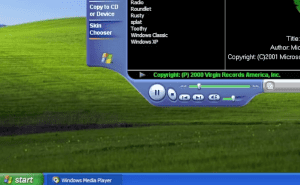
Windows XP brought a visual overhaul and introduced a new taskbar design, offering a blue color scheme and rounded corners. The introduction of grouped windows improved multitasking, and Windows Vista’s taskbar previews provided a glimpse of an application’s content on hover.
Windows 7: Innovations and Improved Functionality
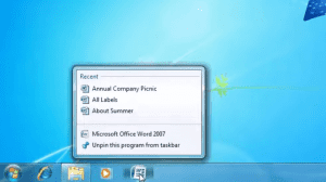
Windows 7 marked a significant taskbar overhaul, eliminating labels for minimized apps and introducing pinned shortcuts. Jump Lists allowed swift access to recent files. The Show Desktop button transformed into Aero Peek, enhancing user experience.
Windows 8 and 10: Adapting to New Technologies
Windows 8 broke tradition by removing the Start button from the taskbar, a decision met with mixed reactions. Windows 10 introduced new taskbar icons, including a search button and Task View for virtual desktops. The taskbar’s adaptability showcased Microsoft’s responsiveness to evolving user needs.
Windows 10: The Introduction of New Taskbar Icons
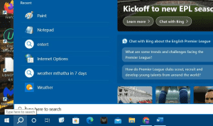
Microsoft added buttons for new features to Windows 10’s taskbar. The Windows Cortana virtual assistant was originally tied to the Windows Search tool. However, Microsoft separated the search tool from Cortana in later Windows 10 versions.
Consequently, Windows 10’s taskbar became the first to include a Type here to search (magnifying glass) button on it for accessing the search box, which isn’t available through the Start menu.
Windows 11: Taskbar Evolution and New Features
Windows 11’s taskbar took center stage with its centralized icons, reminiscent of macOS. The addition of Widgets and their informational value marked a significant enhancement. Yet, Windows 11’s taskbar changes sparked discussions about missing functionalities and a simplified right-click menu.

Reflecting on the Significance of the Windows Taskbar
The journey of the Windows taskbar showcases its transformation from an absent feature to an indispensable component. Its evolution reflects Microsoft’s commitment to user-friendly design and continuous improvement. As users, we rely on the taskbar to manage tasks, access applications, and stay organized in the digital landscape.


