


When you choose pure cotton bedsheets, comfort often comes first. The softness, breathability, and ease of maintenance make it a popular choice. However, once the bedsheet is home, a new question arises: does it actually fit with the rest of the bedroom décor? It’s a common dilemma—too many people either overthink it, chasing trends that don’t suit their space, or ignore it completely and end up with a mismatched design.
Finding a balance is the key. Matching your pure cotton bedsheets to your bedroom décor isn’t about following strict design rules, but understanding balance, proportion, and how the space functions day-to-day. This guide will help you match colors, patterns, and textures in a way that’s both practical and beautiful.
1. Start with the Bedroom You Already Have
Before selecting your bedsheets, take a look at your bedroom as it is today. The color of your walls, the type of flooring, the furniture finishes, curtains, and lighting all play a part in how the bedsheet will look.
If your bedroom features bold colors or heavy furniture, opt for bedsheets that calm things down. If your room is more neutral or minimal, you can use bedsheets to add warmth or a subtle pop of character.
Because pure cotton is a versatile fabric, its matte finish and breathable texture blend seamlessly into various environments. Its natural appearance makes it much easier to coordinate with other materials than glossy, synthetic fabrics.

2. Understanding Color Without Overcomplicating It
Color matching doesn’t require an eye for design. Instead, it’s about restraint.
One good rule to follow when choosing pure cotton bedsheets is to stick to a similar color family as the rest of the room, rather than trying to match the colors exactly. Perfect matches often feel forced, while slight variations create a more natural, effortless vibe.
- If your room has light colors like beige or soft white, bedsheets in muted browns, light greys, or gentle blues will complement the space well.
- If the room is decorated with pastels, choose bedsheets in the same soft tone rather than bold, contrasting colors.
- In darker rooms with wooden furniture, choose earthy tones like sand, olive, terracotta, or warm grey to create harmony.
For rooms with stronger lighting or vibrant décor, you might want to experiment with brighter shades, but be sure the rest of the room remains understated to avoid overwhelming the space.
3. Why Neutrals Are Always Reliable
Neutral-colored pure cotton bedsheets never go out of style. They’re functional, adaptable, and timeless.
Colors like white, off-white, cream, light grey, and beige are perfect because they can complement almost any bedroom style. They also highlight the natural texture of cotton more effectively than bold colors.
Neutrals are especially useful if:
- You change cushions, curtains, or other accents often.
- Your room has patterned walls or flooring.
- You prefer a calm and uncluttered look.
These shades are also great because they age well, maintaining their beauty even after multiple washes.
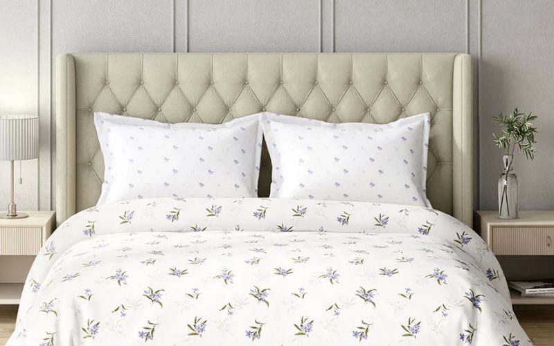
4. Patterns Should Support the Space, Not Fight It
Patterns are where most people go wrong. Either they’re too busy and overpowering, or they clash with existing elements in the room.
If your bedroom already has patterned curtains, textured walls, or a decorative headboard, opt for bedsheets with minimal patterns or even solid colors. Subtle textures like a pinstripe or small check can work well too.
For simpler rooms, consider bedsheets with gentle patterns—soft florals, minimal geometric designs, or stripes that don’t dominate the space but still add personality.
Bold patterns are better suited to large rooms with neutral walls and minimal furniture. In smaller spaces, large patterns can overwhelm the room, making it feel cluttered.
5. The Role of Texture in Pure Cotton Bedsheets
While texture is often overlooked, it plays a significant role in how a bedsheet looks and feels.
Pure cotton is naturally soft and breathable, and depending on the weave, it can appear crisp, smooth, or slightly textured.
- Crisp cotton works well in modern or minimal interiors, creating clean lines and a fresh look.
- Slightly textured cotton adds warmth and blends well with earthy or rustic bedroom designs.
Avoid shiny or overly glossy fabrics, as they don’t match the natural, understated look of cotton. Matte finishes, in particular, blend well with most room styles and create a more grounded feel.
6. Matching Bedsheets with Furniture Finishes
Furniture finishes often matter more than wall colors when it comes to bedsheet selection.
- Dark wooden furniture pairs beautifully with lighter-colored bedsheets, creating contrast and balance.
- If you have light wood or white furniture, opt for warm neutrals or muted colors—avoid using stark white, which can be too harsh.
- Metal or upholstered bed frames are best complemented by softer shades that complement the material without competing for attention.
When the bed frame is heavy, go for lighter bedsheets that provide contrast. For minimal bed frames, you can afford to choose bedsheets with more visual weight.
7. How Lighting Changes Everything
Lighting plays a key role in how a bedsheet color appears. Both natural and artificial lighting can affect its look in dramatic ways.
- Rooms with lots of natural light can handle deeper shades without making the space feel dark.
- Warm lighting will make beige, cream, and earthy tones appear richer and more inviting.
- Cool lighting, on the other hand, can make whites appear sharper and greys look cooler.
Always think about how the bedsheet will look not just during the day but also at night under artificial lighting.
8. Seasonal Adjustments That Make Sense
Pure cotton bedsheets are perfect year-round, but the colors you choose can shift subtly with the seasons.
- In the summer, go for lighter shades like pastels or bright neutrals for a refreshing feel.
- In cooler months, earthy tones and deeper neutrals can create a cozy, inviting atmosphere.
Instead of buying multiple sets of bedsheets, consider rotating two or three thoughtfully chosen colors to keep your room feeling fresh without overloading on clutter.
9. Avoiding Common Matching Mistakes
Here are some common mistakes to avoid when choosing bedsheets for your bedroom:
- Don’t feel the need to match everything perfectly. Gentle contrast often works better.
- Avoid using too many colors in one room. Let your bedsheet either blend or slightly stand out, but not both.
- Don’t base your choice solely on how the bedsheets look folded. Imagine how they will look spread out on the bed.
Final Thoughts
Matching pure cotton bedsheets with your bedroom interiors doesn’t require following trends or design rules. Instead, it’s about paying attention to what already exists in your space and choosing bedsheets that enhance it subtly.
When color, pattern, and texture are in balance, the bed becomes a natural extension of the room, adding comfort without overpowering the décor. Pure cotton, with its timeless elegance and breathable comfort, makes this balance easy to achieve.
A well-matched bedsheet doesn’t scream for attention—it simply belongs.
Want to buy pure cotton bedsheets? Look no further than GM Fabrics, where we offer bedsheets designed for everyday comfort. Enjoy the natural softness, breathability, and timeless style that will transform your bedroom.